Tag: responsive design
Enterprise
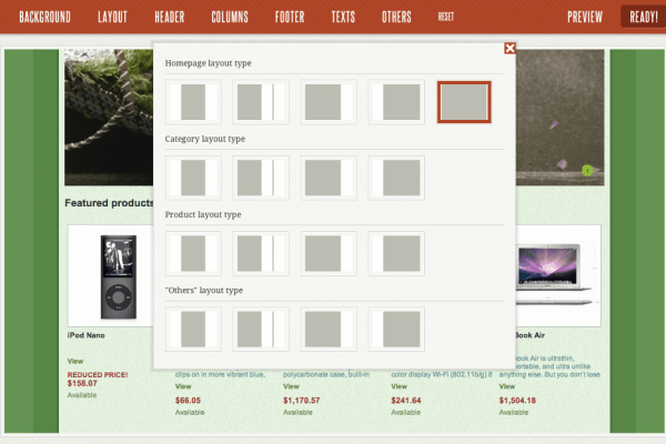
New release – one column layout added!
November 24th – and the second update is available! We’ve added a great new feature which was very demanded – one column layout. But that’s not all. Now you can use a big logo picture in the header and your theme can resize it flawlessly. Another very important improvement – if some column is not […]
Read MoreEnterprise
Responsive theme for Prestashop 1.5
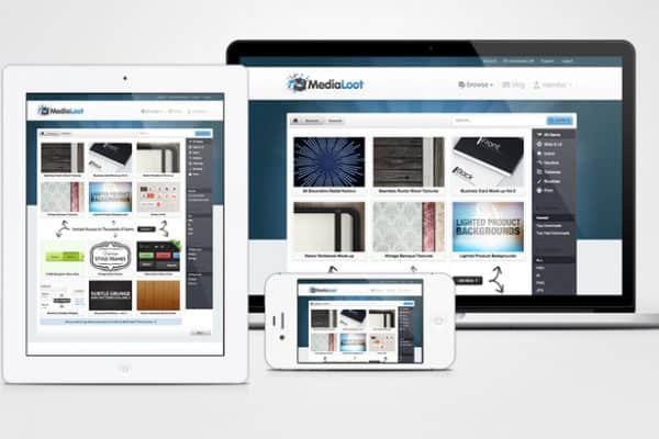
First of all – what is a responsive theme? A responsive theme (as the one used in the Maker) is an approach to web development that allows a website to adapt to mobile devices and the desktop or any other viewing environment. The definition on Wikipedia is quite simple: Responsive web design (RWD) is a web […]
Read MoreEnterprise
Prestashop Theme Maker is launched!
1 idea. 3 months of work. Endless combinations. I’m proud to annouce the launch of Theme Maker project and hope it will help a lot of people in making their great products. I really appreciate the support from Facebook page as well as random visitors on the page who sent me messages. Also my friends […]
Read More

